Weave
role
Founding Product Designer
team
2 Designers, 2 Engineers, 4 Product Managers
timeline
Sep 2023 - Present
skills
Product Design, Interface Design, Interaction Design, Prototyping, Usability Testing, Thematic Analysis
overview
Weave is a group scheduling platform created for students, by students — helping students find time for what's important

Back in Fall 2023, our founder Alex came to me with an idea that he'd been brewing for a few months: "What if we built a group scheduling platform for students?". The problem was simple, students like us were always struggling to find time to see our friends and family, let alone even find a time to meet with our school clubs. Intrigued by the challenge, we formed a team.
Today, after shipping our MVP back in November of 2024, Weave has over 300 active monthly users and serves as the go-to scheduling tool of five different UBC clubs. We're actively working on implementing our UI 2 (see below).
snapshot
A scheduling platformed designed to help people find time for what is important to them
problem
Due to demanding schedules, students struggle to maintain and strengthen relationship with friends and family
We know that students have fluctuating, jam-packed schedules. One day they're studying for a midterm, and the next, they're interviewing for a summer internship. But what always get pushed aside or left behind is the time to maintain relationships with family and friends. Students need a solution that give them more time to prioritize what's really important to them.
the current space
Current scheduling tools are often confusing, tedious, or costly

Existing tools in this space have failed to meet the demand of an easy to use, efficient, and cost-friendly scheduling tool.
While platforms like Outlook, Calendly, and Doodle provide polished tools, they cater towards enterprise users and hide certain features behind paywalls. With what's remaining in the space, despite their cost-effectiveness, they lack the features and overall usability to offer an effortless and enjoyable scheduling experience.
discovery
Who better to talk to than students?
We conducted user interviews with over 30 students, learning more about how they manage their time and make time for friends and family. Our qualitative insights and competitive analysis revealed two common themes circulating around the current gap in the problem space, dictating our design approach going forward.

Given their demanded schedules, students want efficient solutions for their scheduling needs. It's counterintuitive to spend time using a tool that's sole purpose is to give you more time.
If an experience promotes learnability and usability, it naturally makes it easy for the user to efficiently reach their goals. Users highly value clear and simple experiences that intuitively guide users to reaching their goals. The lack of clear signifiers and affordances increases the chances of user mistakes, user frustration, and ultimately, time delays.
ideation
What can we create?
With efficiency and clarity in mind, our team used it as our guiding north star to begin ideating.
Initially, each of us spent time using existing scheduling solutions out there, noting what works, and most importantly, what doesn't. We met on a weekly cadence, sharing our insights, bouncing ideas off each other, and hosting critiques — ultimately helping us gather our design needs, priorities, and goals.

With our priorities set straight, we began bringing our ideas to life. We hosted weekly design jams and critiques, often looping in the PMs and engineers for second opinions — helping us narrow down to our MVP.
beta
Introducing… our MVP and UI 1
After months of ideating, we brought our concept to life with our MVP.
testing
Testing, testing, testing
We were extremely proud to say we built something that we could use to schedule events, but questions started to arise. Was it working like we intended? Did our design reach our goals? How well do our designs make scheduling more efficient and clear?

To find out, we ran usability studies with five participants while running a beta program with three student clubs at UBC. Participants were asked to go through five major tasks involving Weave, answer questions relating to their usability (using UMUX scores), and questions relating to satisfaction. Additionally, we ran beta tests with three student clubs at UBC, checking in with them on a weekly cadence to gather more longitudinal feedback.
our approach
A new approach centred around three major insights
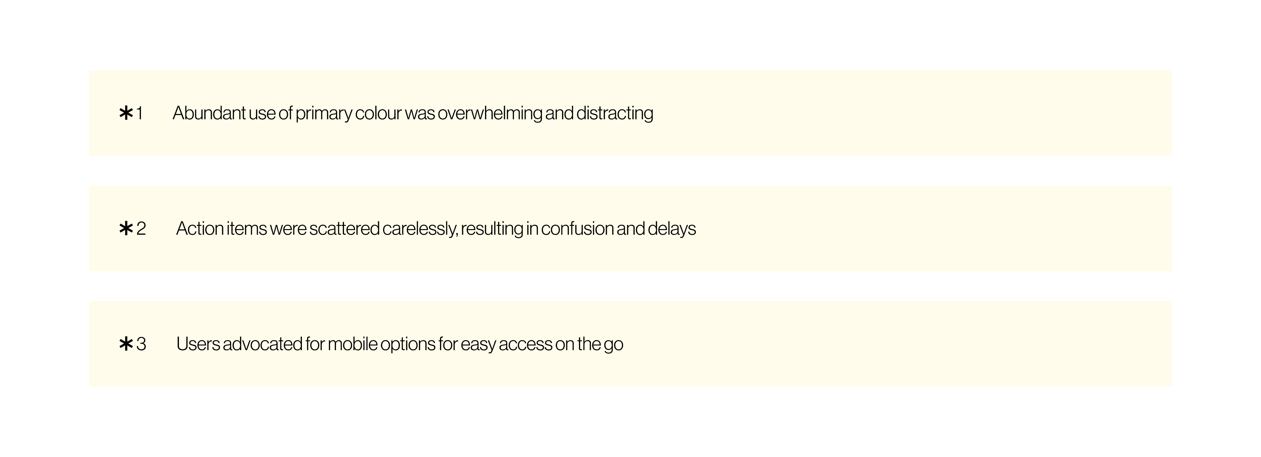
Participants shared three pivotal insights that dictated how we approach Weave's next iteration.
An abundant use of colour made it challenging to figure out what to focus on, resulting in prominent features blending right in
Action items were scattered carelessly, making it hard to follow and reducing discoverability
Users shared a strong desire for a mobile-first approach
design decisions
Removing colour redundancy
A design's foundation rests on it's underlying structures and foundational elements like colours. We believe by addressing the colour redundancies in the design, we could approach the rest of our changes easier.
We did just that. Our team worked tirelessly to do conduct a full-scale audit on our MVP's colour usage, defining colour usage rules to create our new UI 2.
1 Overwhelming colour abundance
Non-sequential date signifiers
Students don't want to have to modify their availability because the interface wasn't clear. Sometimes, dates in an event are non-sequential. The date beside Monday may not be Tuesday when someone asks for your availability on a Weave. We ensured we included clear signifiers to help users intuitively realize when dates are non-sequential — avoiding costly mistakes.
1 Overwhelming colour abundance
Contextual tool dock
Our beta had buttons placed all over the place. Students weren't sure how to share Weave's or whether or not they were editing their availabilites — exactly what we didn't want. Inspired by Figma, we consolidated all our tools into a neat dock for easy use.
2 Carelessly scattered action items
Mobile-responsive design for on-the-go scheduling
On the bus? Walking to class? We made sure Weave was accessible for students anytime, anywhere. Students don't want to have to pull out their laptop on their way to class to fill in their availability for an event.
3 Mobile-first design
reflections
Constraints teach adaptability
Learning to work with engineers and PMs means being sensitized to ideas being shut down due to engineering roadblocks and feasibility. My time at Weave tested my ability to be a quick adapter — learning to create within the walls of "no"s. Drawing inspiration from patterns shared in drastically different industries, I've learned to use the world around me as source for working around the bounds of reality.
Curiosity to new heights
My time at Weave inspired me to not only use the world as a source of inspiration, but also a canvas of critique. I find myself spending time concerning myself with why a water fountain was designed the way it is, or thinking of solutions to inform the flight attendant I want them to leave my dinner on the table without disturbing my sleep.
Passion is contagious
Working with equally passionate people is what made Weave the work that it is. Designing for users is a given, but the passion my team brought made me want to not only design for the users, but also to design for them. When a team is passionate and cares deeply for the work, the work will naturally write itself.
today
Weave is live
Back in November of 2024, our team launched our MVP to the world — our first step in helping students find more of their most valuable asset, time. You can try it out at weaveapp.ca. Today, we have over 300 active monthly users that use Weave to find time to make memories.
The work you see in this portfolio has yet to be shipped and acts as a preview for the next chapter of Weave. Working with our engineering team, we're building out the new UI with NextJS and React — take a peek below :)
thank you
Two years in the making
